A personal UI/UX challenge
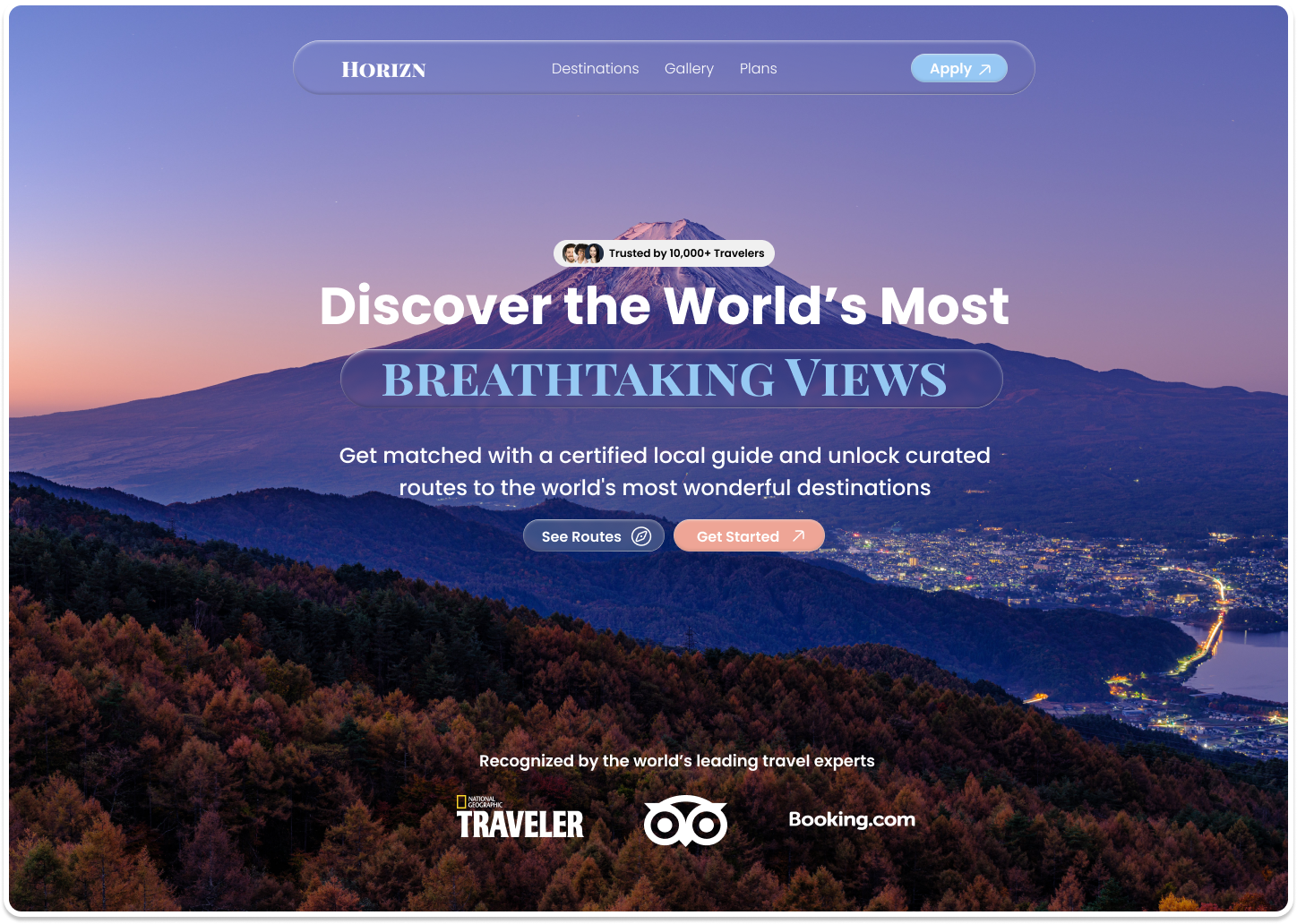
As part of my journey to sharpen my UI/UX skills, I challenged myself to design a hero section from scratch using a specific visual style. I chose Glassmorphism - SaaS Hero Section
The goal was to design a clean hero section with a clear value proposition, strong CTA, and proper use of the frosted glass aesthetic.
Glassmorphism felt like the most exciting and technically nuanced style to explore. Unline neumorphism or neo-brutalism, glassmorphism demands a string visual foundation to work, you need the right background, the right typography, and a genuine understanding of layering and depth.
It also gave me the most creative room to work with.
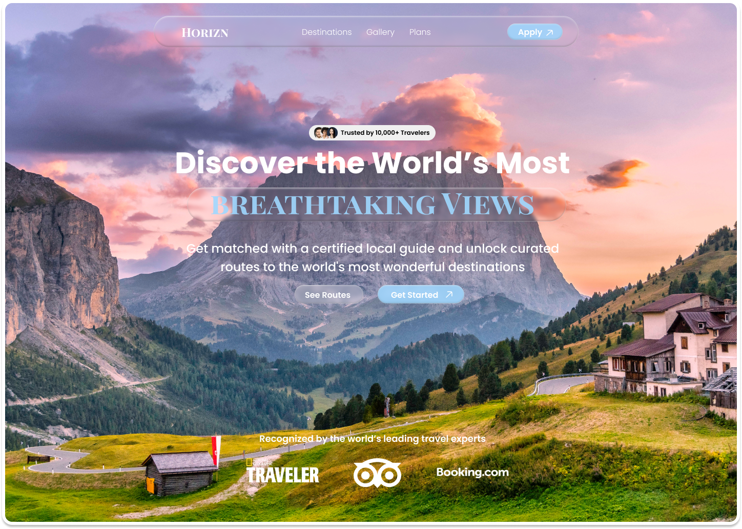
Rather than recreating an existing SaaS product, I designed an Imaginary platform centered around curated sightseeing experiences.
The Idea: A program-based platform where people apply to get matched with a certified local guide who takes them to breathtaking, off the road destinations around the world.
Why this works well for glassmorphism:
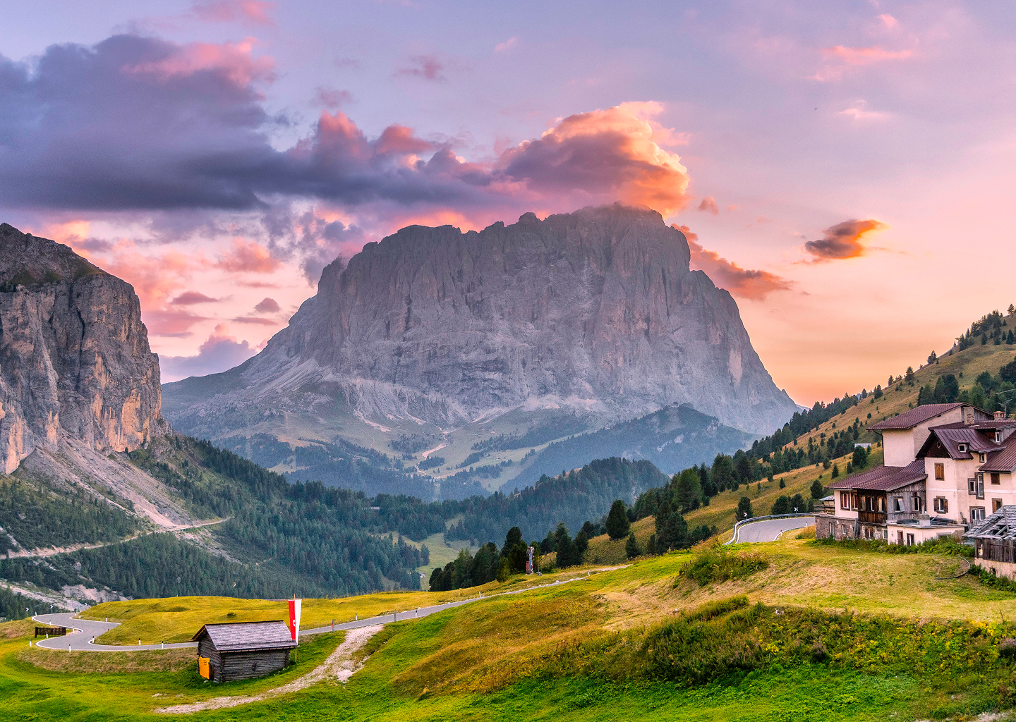
- Landscape photography backgrounds are a natural fit for frosted glass overlays
- The frosted panel literally mimics the feeling of looking through a window at a view
- It gave me rich visual depth to layer the UI against
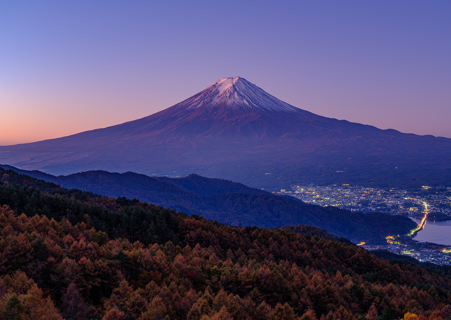
I started with the background, a high resolution landscape photograph. I applied a subtle dark gradient overlay so the glass panels and text would remain visible without fighting the image.
I used Poppins as my primary typeface
- Headline: Poppins 700, large & commanding
- Subtext: Poppins 400, soft & readable
- Maintext: Playfair Display SC, highlight important text
The core hero glass card used:
- Background: #FFFFFF
- Backdrop blur (20px)
- Border: 1px solid #FFFFFF
- Subtle box shadow with a soft glow on the edge
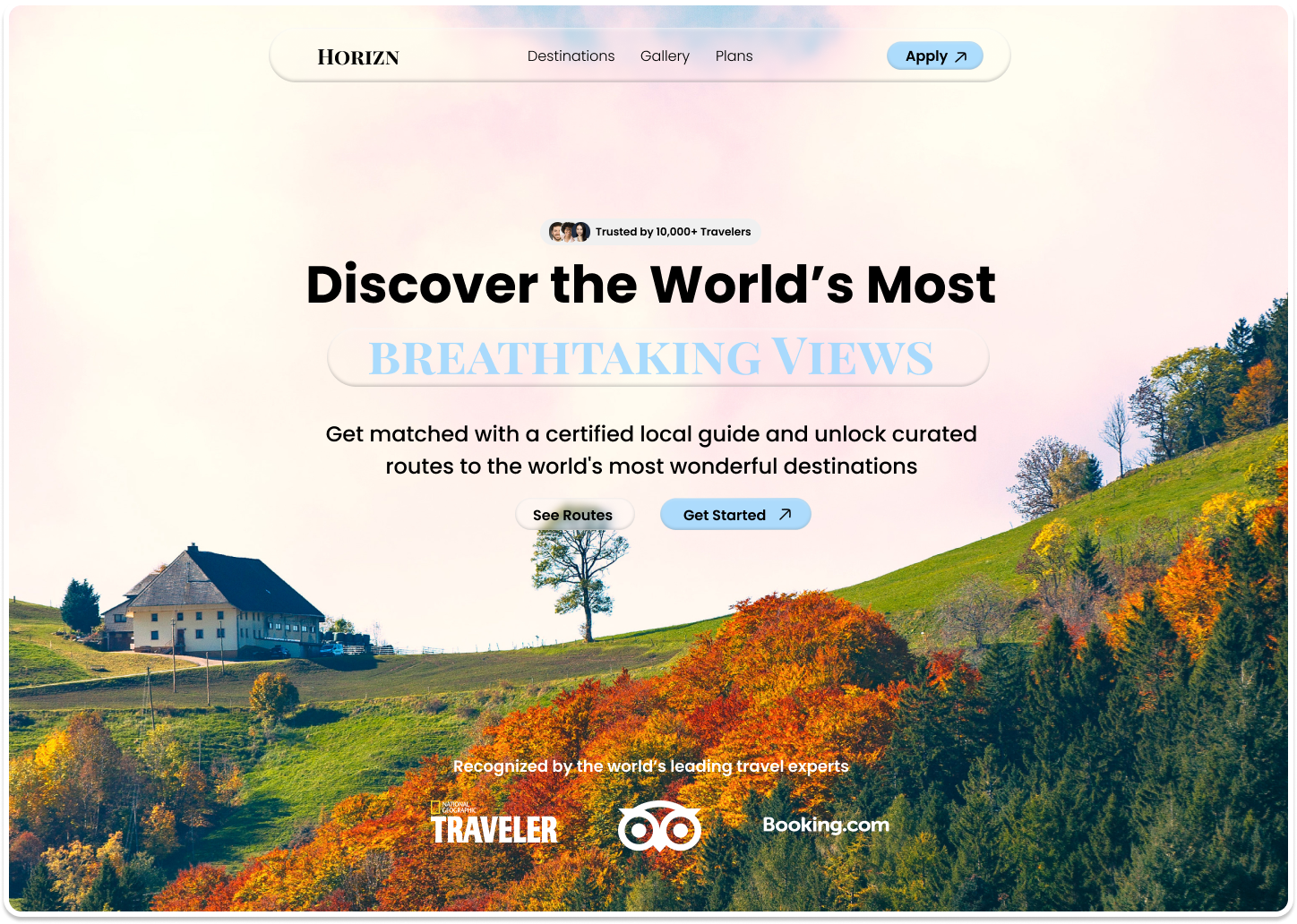
- Glassmorphism is deceptively simple, the real challenge is maintaining legibility while keeping the frosted effect strong
- Background choice is arguably more important than the glass itself
- White opacity hierarchies are a powerful way to create depth without changing hues
- Less is more, overcrowding a glass panel destroys the elegance
This challenge pushed me to think beyond aesthetics and focus on usability within a style. Glassmorphism isn't just about making things look pretty, it's about controlling depth, contrast, and hierarchy in a way that still converts.
Every project like this teaches me something new, and this one was a genuine joy to design.
Designed in Figma, Desktop 1440px, March 2026